Background
Property management company collect its customers' information online, bring the solution to make an income from their old houses and offer insurance and a mortgage rate to buy new homes.
Challenge
Improve Sign-up flow from the old mobile version to increase conversion rate
Role: UI/UX design, user research, prototyping, usability testing
Process: Competitive Analysis, Quantitive Data, User Flows, Wireframe, Prototype, Usability Test
Research
Comparative analysis: Observe the sign-up flow of other apps
Quantative data research: examine existing sign-up flow, analyze page visits, conversion rate, frictions that cause users give up.
Comparative analysis
Products that are similar to Knox, their sign-up flow is completed by submitting user’s email and password. and give users access to account setup immediately. However , in Knox app users must submit all mandatory information to finish the funnel in other to collect qualified leads.
Quantitive data analysis
It is focused on how various data in the funnel reflect users’ pain point and needs. the goal is to discover correlations and possible unforeseen patterns. Some steps of the account setup were discovered with high drop-off rate then other steps.
Opportunities
According to research, it indicates whether our Sign-up flow, which is different from the most of others, with a low success rate is related to user’s needs and pain points and make it necessarily looked into each stage.
Problem statement
How can we help users understand the information and trends about their properties through a simple sign-up flow and make smart choices?
Finding overview
Goal 1: Increase lead quantity
Pain point: long process
Need: simplify steps to complete
Opportunity: Reorder tasks and divid them in several segments, trim down unnecessary questions, (bring “Calendar” to schedule to call before Account setup so that user feel engaged and shorten process to complete to sign-up, and start thinking about portal design to be a gateway for user in and out to fill out the information whenever they are ready instead of using phone call.
Goal 2: Clear visual and text guidance
Pain point: confused with error signs and definitions
Need: add explanations and give clear directions
Opportunity: add more error signs, tags, reexamine UI consistency, explore the page with high drop off rate and what’s cause such as document upload page - loading time, calendar to schedule-overlapped date and time among users, small buttons to choose date, issues with error messages entire steps
Ideate
Based on the analysis, some UI elements are adjusted focus on consistency such as spacing, font size, margin, button size , and add question icons, bubbles, tags.
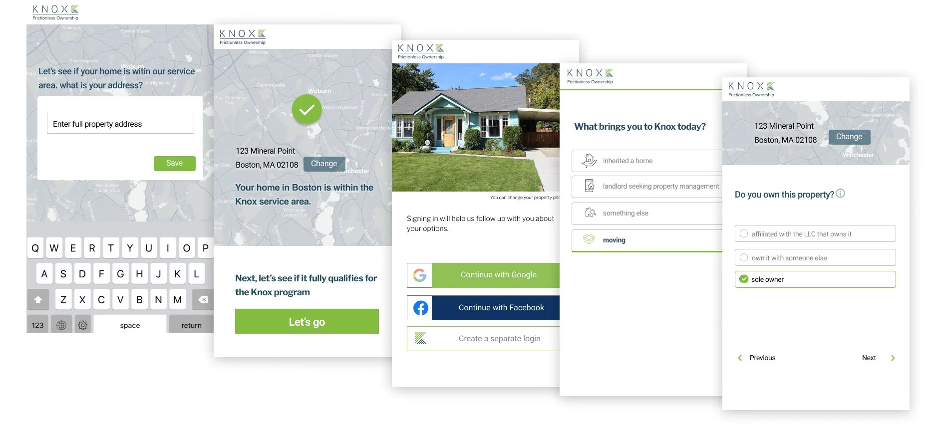
For the sign-up flow, we divided it with two flows, sign-up ending with calendar to schedule and account setup instead of making it long process of one flow. When user is back it will start where user stoped last time.
Evaluation
After making the prototype, participants from each team tested it and left sticky notes about their difficulties or suggestions, and answered six questions with rating scales in FigGem.
Outcome
Impact
Having a simple sign-up flow and giving users clear questions and guidance increases usability and the success rate.
The outcome of the project
The number of users who completed the sign-up flow increased
The drop rate between pages has also decreased
After sign-up, the user can see more accurate property forecast results by inputting the addeditional information.
Next step
After sign-up, calendar page to schedule setup needed to be updated. Start research for user portal app.


