NURI
A charity donation platform to support North Korean refugees

Background
NURI (North Korean United Refugee Intervention) is a search tool particularly for those seeking to give aid to North Korean refugees all around the world. There are currently many refugees from North Korea (Democratic People’s Republic of Korea) living in hiding in Russia and China, South Korea, Japan. Credible sources put this number at somewhere between 100,000 and 300,000. Among those refugees are many who crossed the border to escape starvation from the widespread food shortage in their country. Many others crossed the border to flee torture, prison camps or public execution. NURI focuses on helping donors who want to help, but also to choose and know where their help goes and be able to see the immediate outcome and progress of where their donation is delivered and invested.
The challenge
Create a responsive platform which makes easier for donors to find causes and non-profit organization, to list causes.
The outcome
A responsive platform that is easy to use, reliable and that makes it easier for donors to find information and. and donations.
The branding developed conveys trust and communication of NURI’s belief in a simple and effective manner.
Role
UI/UX designer responsible for user research, strategy, UI design, prototyping, visual design, usability testing, and branding within a Lean UX framework.
Process
Define
Task Flows
User Flows
Persona
Site Map
Research
Competitive Analysis
Primary Research
Synthesize User Personas
Design
Wireframes
Low-fidelity Prototypes
Brand Style Guide
Logo Design
User Interface Design
Refine
Usability Test
Usability Test Findings
Iterations & Next Steps
Research
In order to gather insights on the subject, I have conducted two rounds of research. A competitor analysis to better understand the charity and non-profit organizations landscape and, 1:1 interviews which helped me to identify consumers’ needs, pain points, requirements and to identify opportunity areas to design against.
Competitive analysis
The competitive analysis was conducted to get a better understanding of already existing platforms, including both direct and indirect competitors, and to identify key features and requirements.
Summary of findings
Some of the best practices I identified include: filters and sorts for users to explore and by using images, video, they bring updated news and connect the local-driven organization.
1:1 Interview
Research setup
Interviewers were conducted with 3 participants between 40 to 50 years old. All the participants were selected base on their interest and involvement in the topic. They have already donated in the past and they are interested in doing it again in the future. This gave me insights on what pain points they have encountered and what tools and information they needed in their previous experiences.
Findings overview
Goals
Choose the charity that is rewarding and have personal connection to users.
Find the charity that proves worthy of users’ trust and commitment.
To be able to make an impact and be part of improvement of human experience.
Primary Research
Synthesize User Personas
Pain points
● Hard to find a non-profit organization that is trustworthy and reliable.
● Not sure their donation is invested on the projects that they choose.
● Not feel secured to share private information on donation sites.
● Not be able to navigate through different subjects to donate.
Needs
● Features that help users’ navigation
● Utilize transparency and dependability to gain user’s trust
● Bring empowerment and personal connection between users and projects
● Use a reliable online certificate to secure donor’s payment and privacy
Opportunities
● Figure out ways to be transparent, dependable and effective. All participants show concerns of how trustworthy the site is.
● Use contents or commutation as ways to bring user’s emotional satisfaction. 2 participants want to see the impact of their donation.
● Features that help users to explore projects in which they have interest. All participants want to be informed or navigate projects in which they are motivated.
Define
From the research phase, I was able to gather insights which were synthesized into a persona that will later be used as a basis to design against. Then. I created a storyboard based on the persona to identify possible user scenarios.

I created a persona, her name is Anna. She owns a florist business and she's a happy and joyful person who likes to help others. She is actively involved with the community and she constantly helps her neighbors when needed.
Storyboard

Design
Once I identified the main requirements and needs to meet the user’s needs and expectations, I started sketching the pages that I would need to have and map out flows and sitemap.
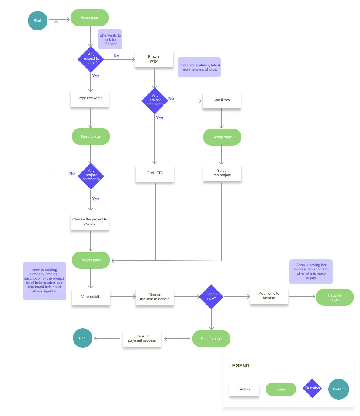
Sitemap and Flows

Task flow
I picked a task that Tasha wants to achieve and made a linear path.

User flow
it is branched out paths for Tasha’s decision to optimize her user experience.
Sketches and Wireframes
The sketches helped me to explore different ideas and start defining the page structure and hierarchy of the elements within the pages. After several iterations, the sketches were translated into wireframes for both desktop and mobile.

home page, categories page, project detail page

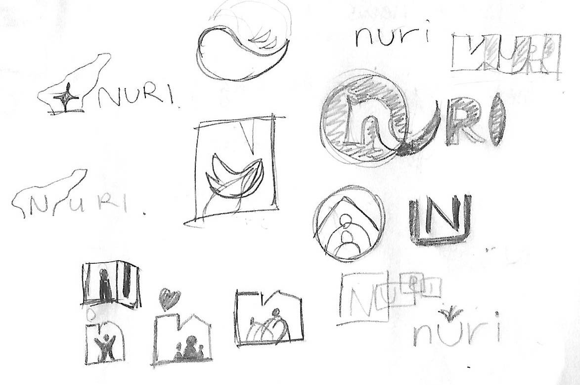
Style guide and branding
After having defined flows and page structure, I went through a few iterations to define a design language and visual direction for the website. I wanted to create a design style that reflects hope for a bright future and communication between the nonprofits and users efficiently.
UI Kit

Final outcome
I added actual images, relevant written contents and additional information as close as final product.


Refine
Within this phase I have created a prototype to test with people experienced in donation and gather input for improvement. The participants were given the task of finding a project in a specific subject and complete their donation process.
Usability test
3 participants were asked to walk through the prototype. I asked each participant to complete the donation process through the steps according to the information in the scenario with a few steps I provided. I observed each participant’s behavior and took notes as they navigated the site and ask questions after they finished.
PRO
Ease of navigation
Simple design
Notification
CONS
Confusion with item options
Unclear functions of CTAs
Lack of descriptions
Next step
After usability test, I observed that all the participants seemed to enjoy being able to find projects that they are interested in and choose items recommended to contribute. They also liked the feature that they can receive the notification when items are delivered. However they suggested having more information on the project page and, they were confused with choices between a money donation and items contribution. I will make a few changes as below:
Make distinction between the gaze bar card and item cards.
Change color or shapes of each CTA to avoid confusion
Add more information to the project page
Takeaways
This was a challenging project to complete independently, I learned a lot about non-profit, charity organizations. It gave me the opportunity to get more practice on the design process by synthesizing ideas and researches while creating a connection between donors and non-profits.